The VPN Connection is an increasingly popular service among personal use and business use. The global VPN market size is projected to reach USD 3749.5 million by 2027 from USD 1772.2 in 2020 at a Compound Annual Growth Rate of 11.3% during 2021-2027 (source). That was why the client contacted our team to design and develop a VPN application amid the dynamic developing VPN market.
Goal:
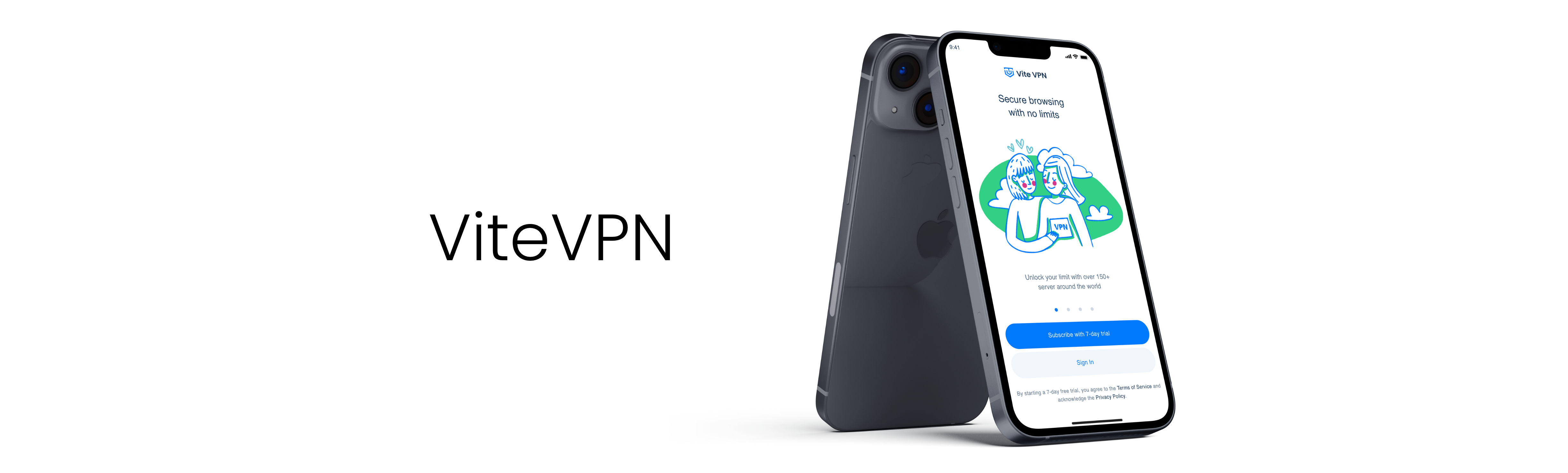
Design and develop a mobile and desktop app called “ViteVPN” with functions that satisfy the targeted user segment.
Who?
The app is perfect for both personal use and business use who only need an easy-to-use designed app with a high-security connection.
How?
By researching current most popular applications, including some VPN apps, and by applying user-centered design methodology, we expected to produce beautiful and loved applications.
Duration
6 weeks
October 2021 – November 2021
Role
UI/UX Design member
Tools
Sketch, Illustrator, Miro, Xmind
2. COMPETITOR RESEARCH AND FUNCTION LIST
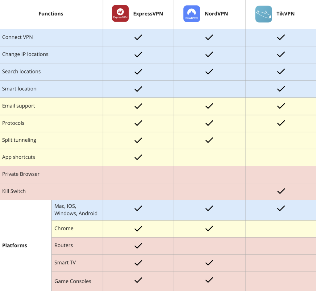
To begin the project, we conducted an interview with the client and together we filled out the project brief which will be used for further research. Based on the project brief, we identified 3 among many competitors in the VPN app market which are ExpressVPN, NordVPN, and TikVPN.
The first step was to download the three apps from Google Play or App Store. For each application, I evaluated its usability, visual design, and most importantly, the utility to users.
Besides strengths and weaknesses, exploring these apps gave us a sense of what functions most of the current VPN apps are offering and what are their selling points.
Based on the popularity of each function and its requirements for users’ knowledge, I classified the list into 3 function levels:
Blue ones: the most basic functions that most VPN apps offer.
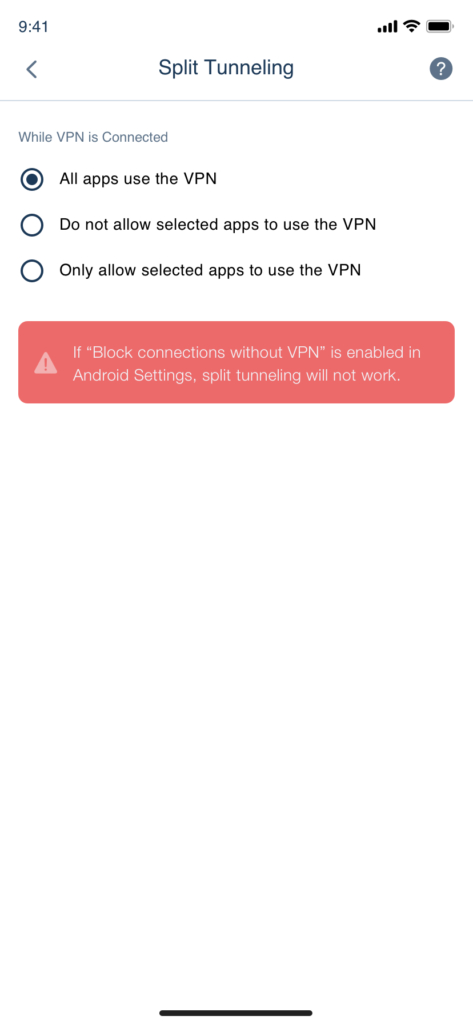
Yellow ones: the second most popular functions and they may require a bit of user’s knowledge. VPN Protocols is an example as it is a must-have function while not all users have an understanding of it.
Red ones: includes the least common functions like the Private Browser and the ones that require users’ advanced VPN knowledge to use like Kill Switch.
Building red functions for the new app would be a heavy-lifting job while making the app way more complex and thus harder for maintenance. Therefore, aiming at the blue and yellow functions at the beginning is a good choice to cover the majority of users’ needs while keeping the app simple, smooth functioning and so user-friendly.
Similarly, this new app will operate mainly on Mac, IOS, Windows, and Android as those are the most popular platform being used.
However, that function list is not a fixed one. When the application’s launched for a while, more user research will be conducted to decide what function or platform should be added to meet the fast-changing users’ demands.
The bottom line
Despite each app showing a different function set and interface design, learning them still helped us find out the common core functions, some good ideas of how to structure our app, and then initiate our own design system.
3. USER INTERVIEW
In order to better understand the users, I interviewed some of the professionals whose job or their daily activities require a VPN connection.
Interview Script:
Are you a student, professional, or both? what are your daily routines and responsibilities?
How do you find a VPN app to try? what are some qualities of a good VPN app?
On what device do you use VPN? where do you use it?
Tell me about some of the VPN apps you have used and why you choose the current one over the past ones.
What features of the current one that you think need improvements?
What motivates you to keep using a VPN application?
If you were a VPN app designer, what feature you would love to add to the app?
Learnings
The interviews helped me identify several common themes that ran through most of the users:
VPN connection speed is of great importance to use other applications and surfing websites.
VPN connection log should be visually available to check the connection history.
Feel special when VPN can help access great resources with great identity protection.
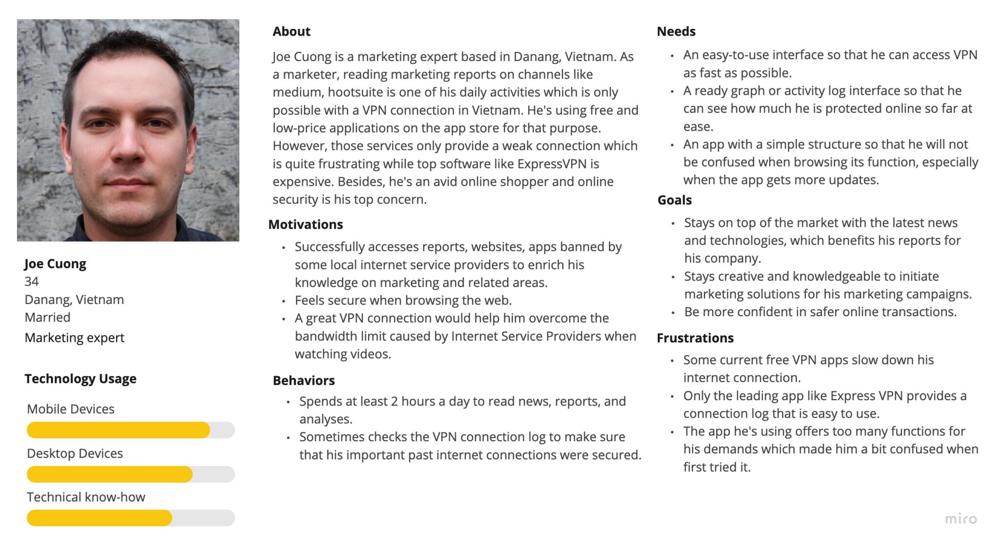
4. USER PERSONA
Armed with insight into users’ needs and goals, I create a user persona – Joe Cuong to empathize with the user.
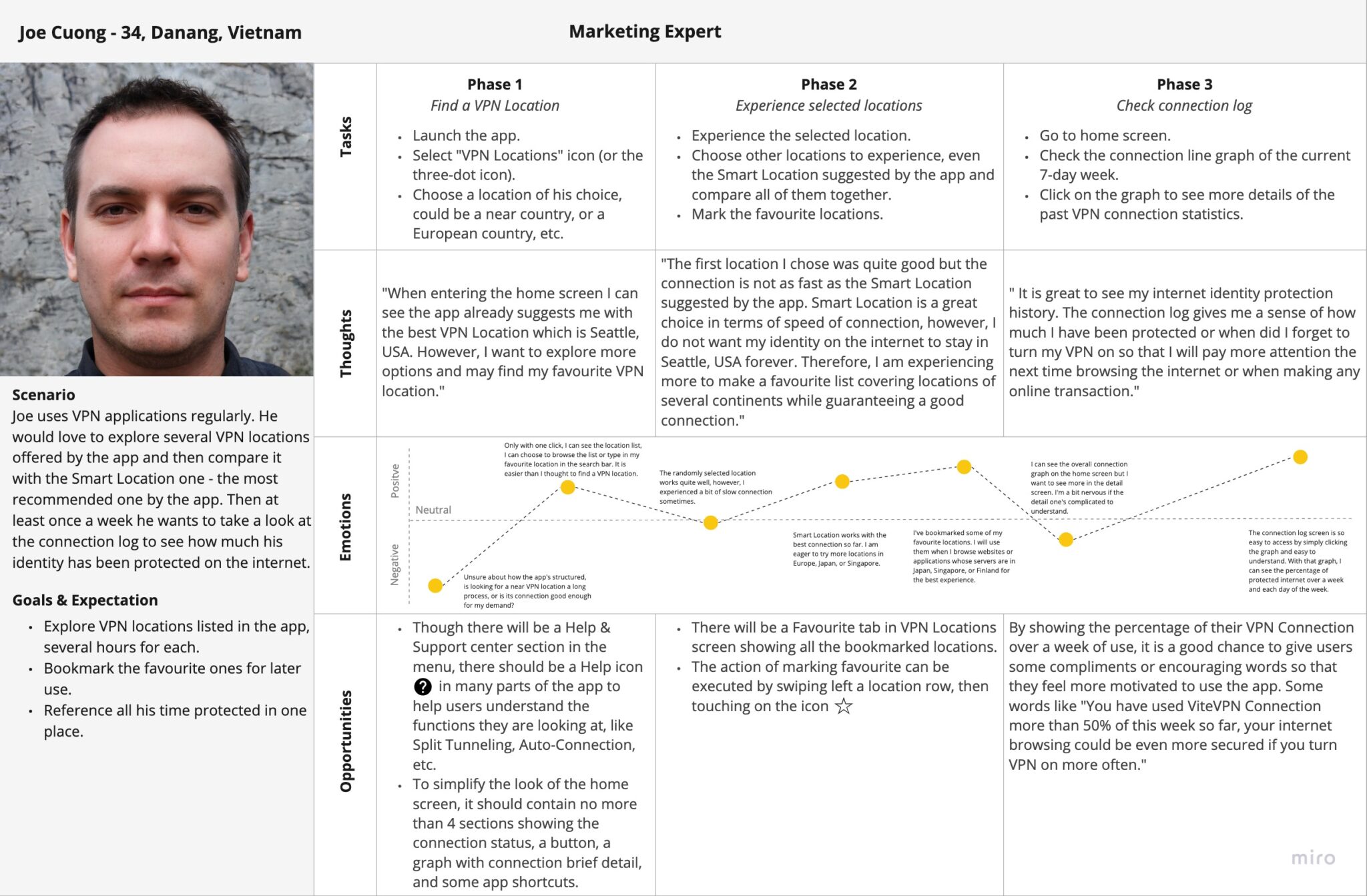
5. USER JOURNEY
Before I could get started designing for Joe, I needed to make a visual presentation of how he feels when using “ViteVPN”. Identifying his low points and high points helped justify my later design decisions.
6. USER FLOW
With user persona and journey come to life, it’s time to map out how Joe completes key tasks with ViteVPN.
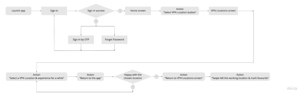
Flow 1: Find a VPN location to connect & experience.
Entry Point
Joe launches ViteVPN.
Success Criteria
Joe signed in successfully and find a VPN location to connect.
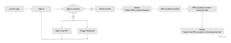
Flow 2: Mark a VPN location as favorite for later use.
Entry Point
Joe launches ViteVPN.
Success Criteria
Joe signed in successfully, went to a VPN location, and marked it as favorite.
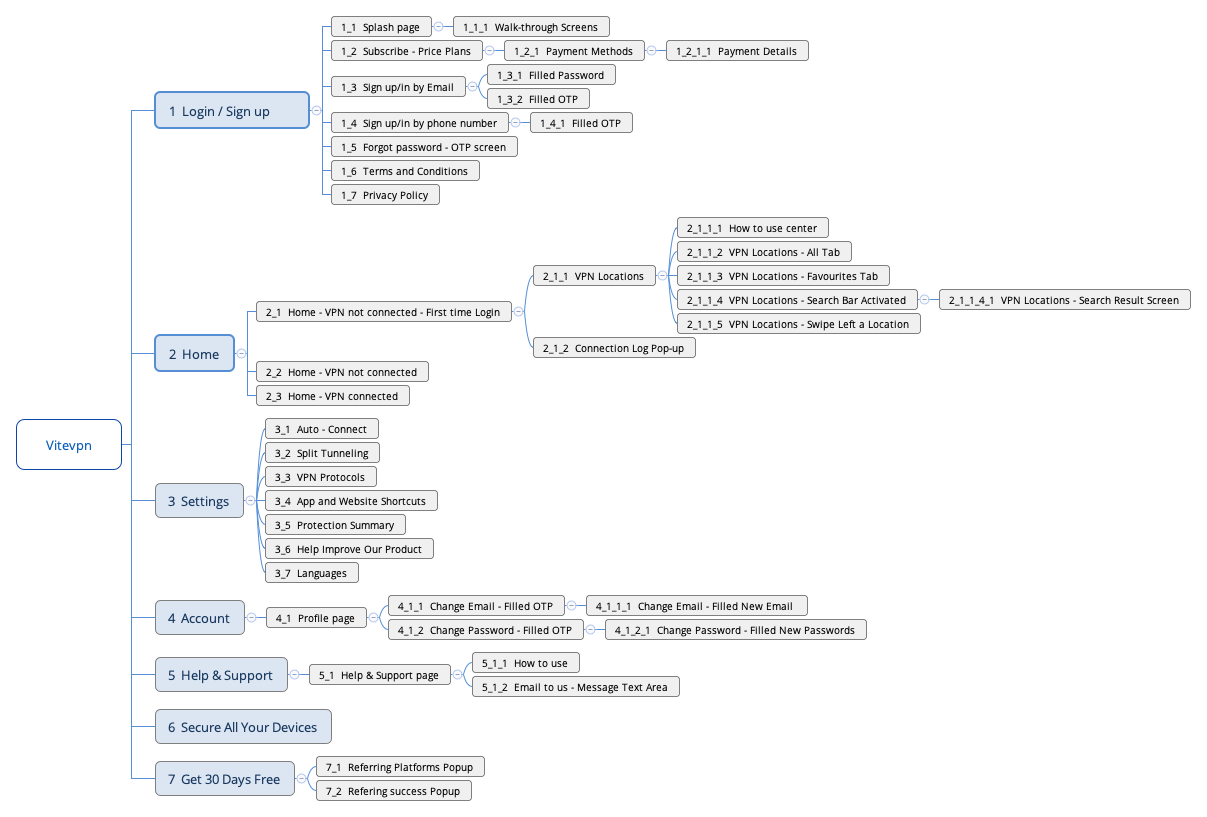
7. SITEMAP
To visualize the information architecture of ViteVPN I created a Sitemap. Besides, this sitemap was also organized in a way so that the development team could use it to estimate their work time for each flow.
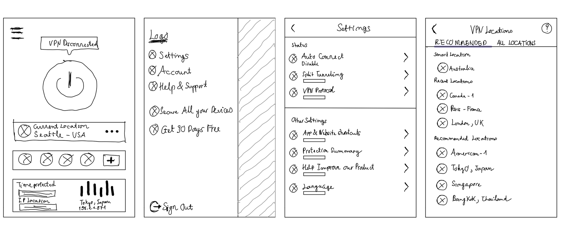
8. LOW AND MID-FIDELITY WIREFRAMES
With the Information Architecture and a mood board of app inspiration collected by me, I started to sketch and make mid-fidelity wireframes to get feedback from other stakeholders. This step would help me feel more confident before applying any UI design elements and also reduce changes in the future.
Sketches
After sketching with pencil and paper, I used Miro to make a mid-fidelity version with most of the key screens.
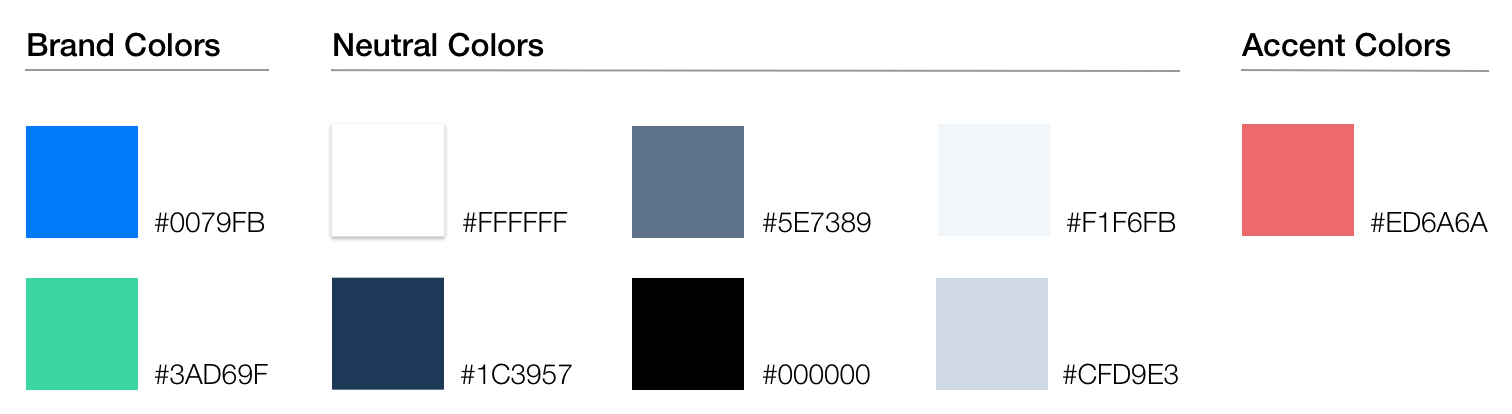
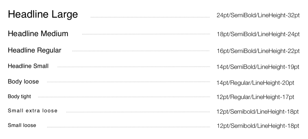
9. COLORS & TYPOGRAPHY
Now I had most of the screens ready, it was time to define a design language to make the app look not only consistent from screen to screen but also vibrant and thus user-friendly.
Colors
Besides brand colors, neutral colors will be used wisely on texts and backgrounds to guarantee contrast for accessibility.
Typography
The font family that was chosen is Poppins. I made a hierarchy of fonts based on font sizes/line-heights, font weights, character spacing so that we always had good choices for every context.
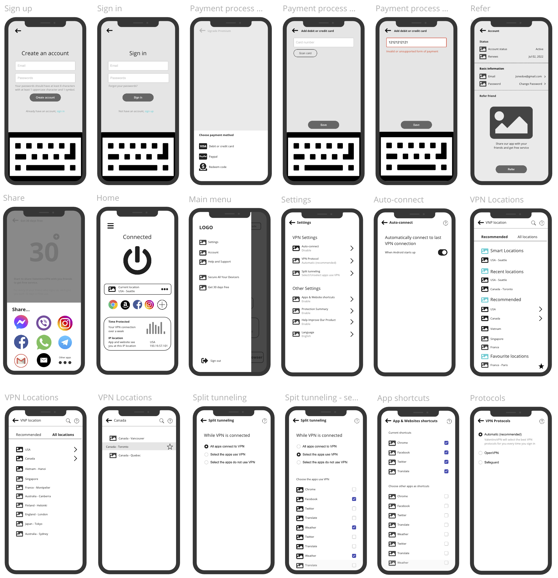
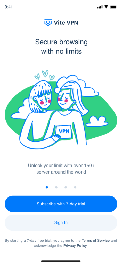
10. FINALIZED SCREENS
After many iterations and tests, I came up with the finalized screens using the defined design elements.
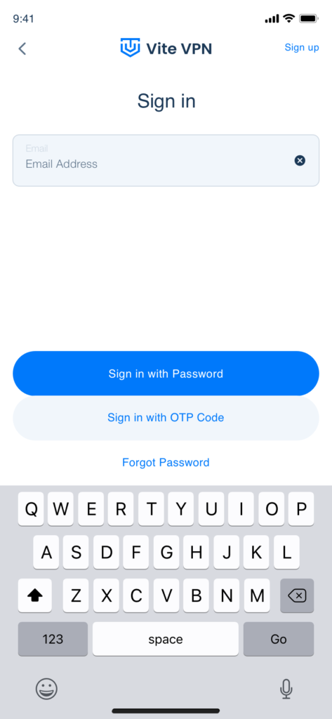
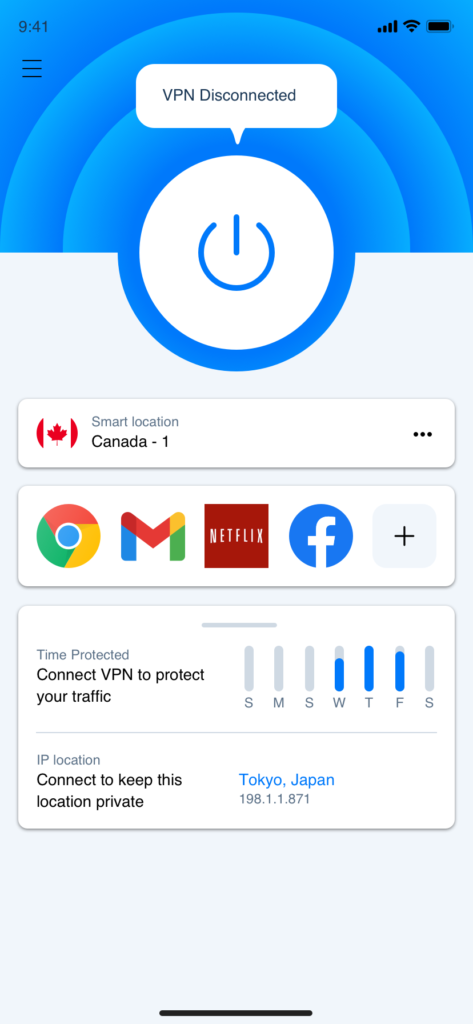
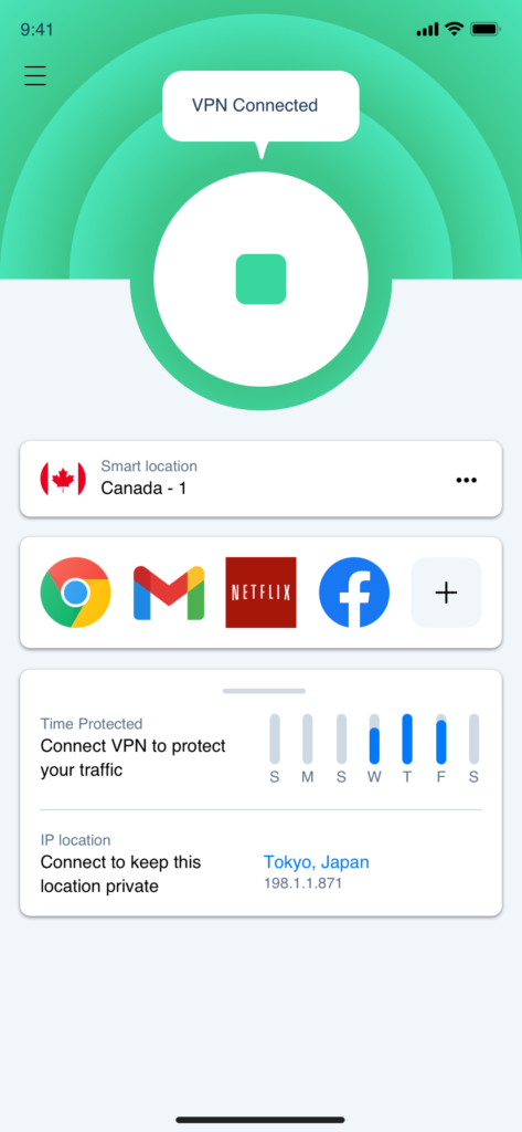
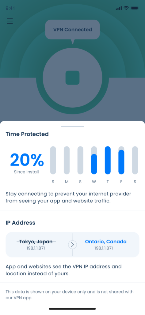
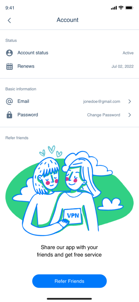
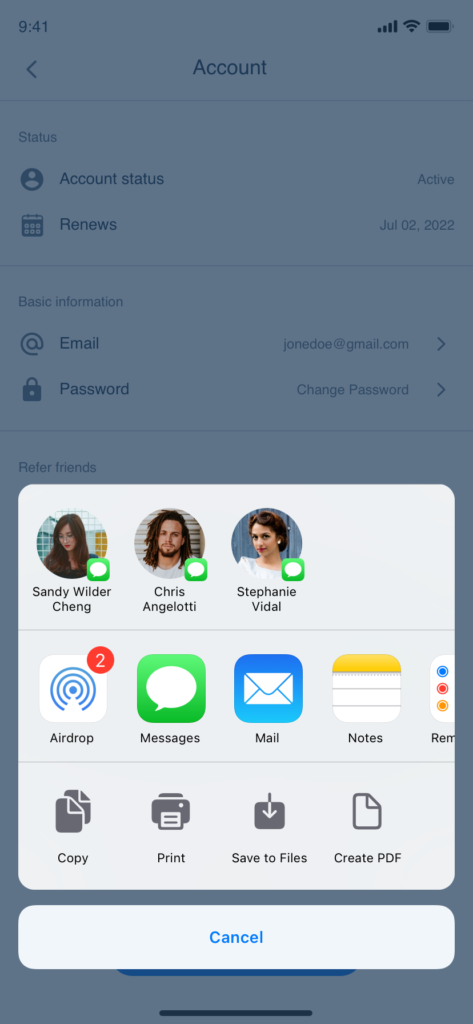
Walk-through screen, Sign In screen, Home-disconnected screen, Home-connected screen.
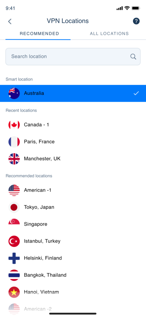
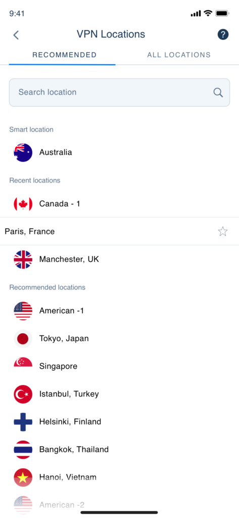
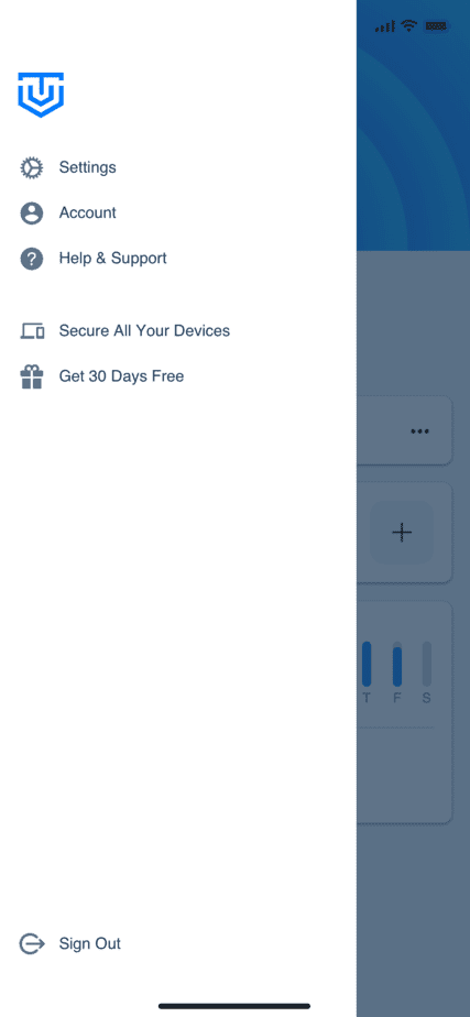
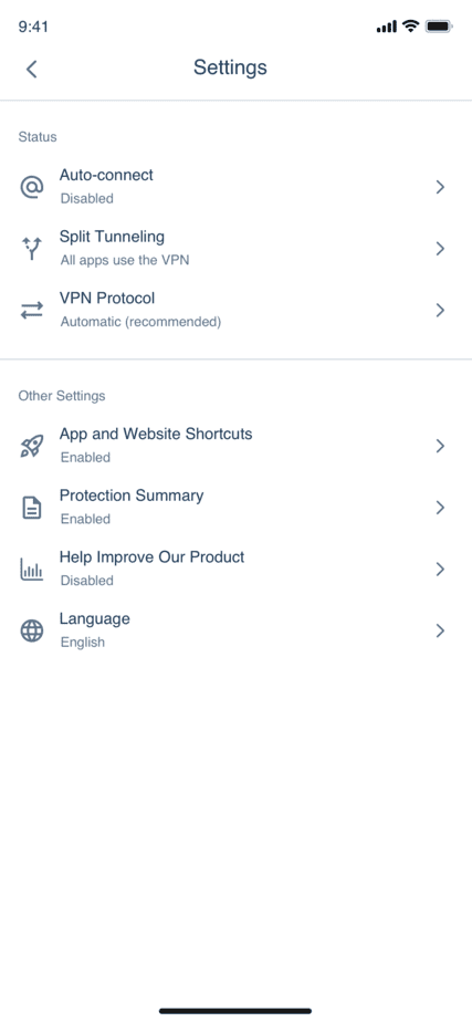
VPN Locations, VPN Location – country swipe left screen, Menu screen, Settings screen.
Working on this project brought to me a deep understanding of a VPN Service, what functions should be included, who are its clients, the technologies behind it, etc. Every project I work on helps me understand a specific area on an amazingly deep level. That is the reason why I enjoy working as a UI UX designer.
Besides, through this ViteVPN project particularly, I also learned that before completing any design deliverable, I should organize it the way it benefits other stakeholders the most like the way I constructed the Sitemap and the final UI designs so that they are easy for our developers to handle.