Challenge: Discover the pain points of the current app and propose solutions to improve user experience.
Deliverables: User research report, Persona, Task flows, Sketches, UI, Prototypes.
Role: Solo Designer.
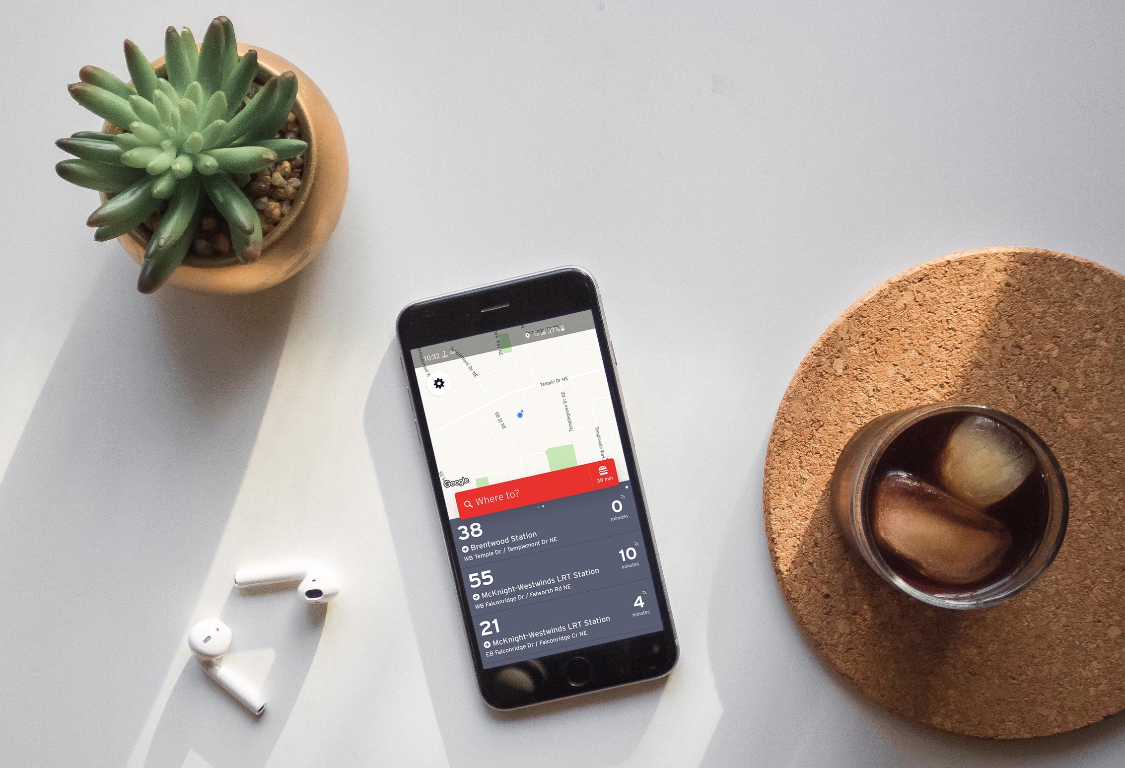
Calgary Transit is the most popular app among commuters in Calgary.
I was an avid user of the Calgary Transit app and already had several pain points when using this app. The more I used this app, the more my pain points raised my curiosity of it and its users with questions like “how do other users use the app”, “what problems they are facing”, etc. So I decided to start my own project, using my research and visual design skills & experience to discover more about the app and its users and suggest the approaches to solve their pain points.
Challenge
The challenge is to understand Calgary Transit users’ response to the current mobile app, discover their pain points and propose solutions to improve their experiences.
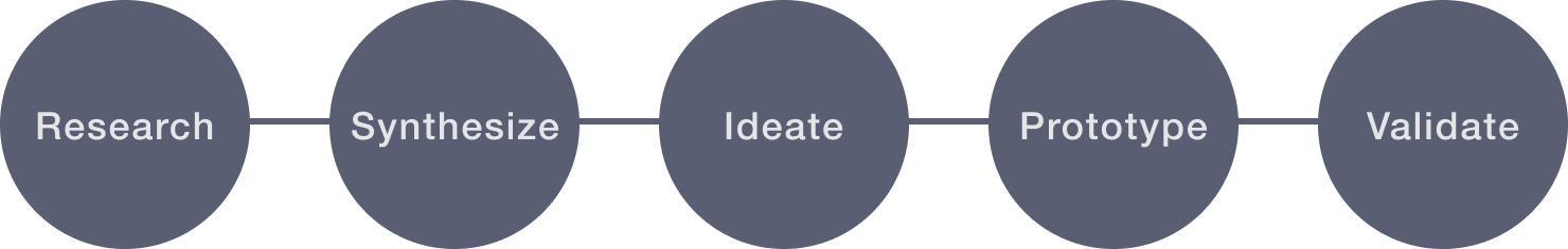
Process
For the user research, I conducted usability testing to discover the current users’ frustrations. Then I used affinity mapping to analyze and prioritize problems. Generating task flows helped me to understand wherein the process users were having problems. Then I created Lo-Fi sketches and Hi-Fi clickable prototypes to illustrate my ideation and use them for validating with users to confirm the pain points are solved by the redesign. The project time is three weeks. Let’s go deeper into each step.
RESEARCH
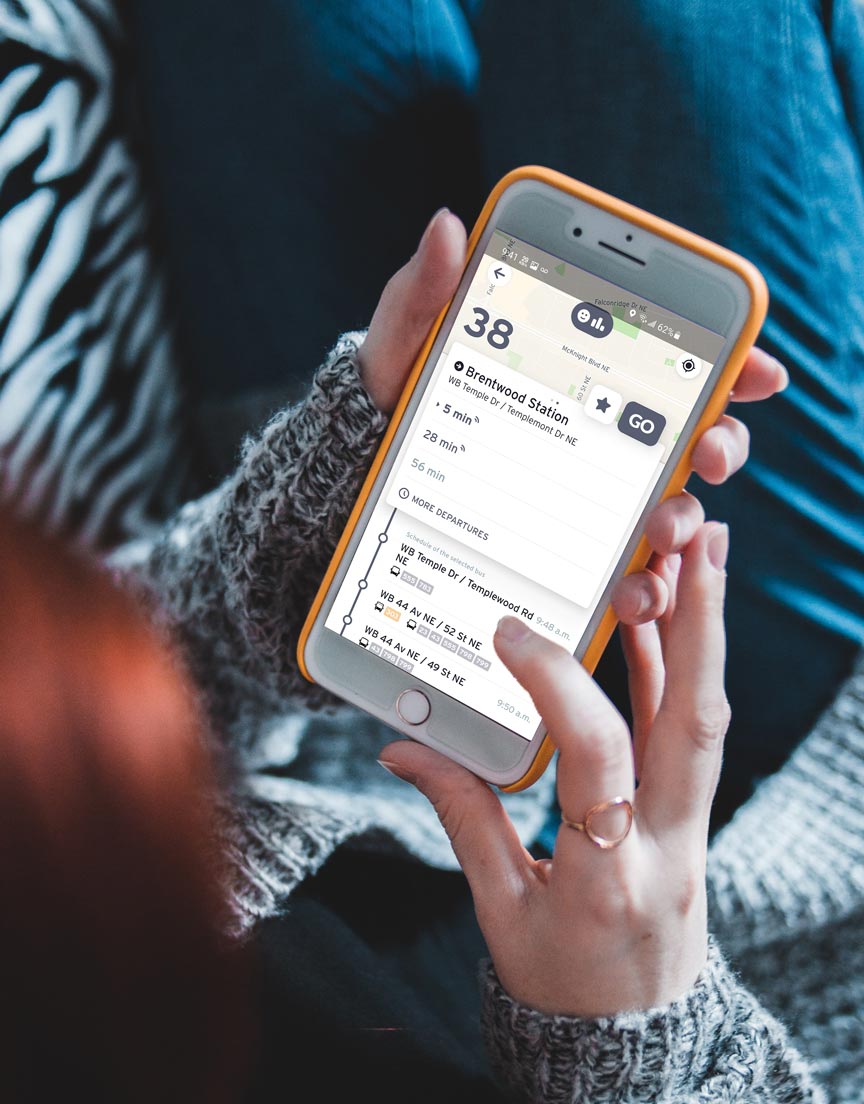
Usability Testing
I started the user research by interviewing 7 users who are avid app users to understand their backgrounds, their daily behaviors related to the app, their motivations, needs & goals when using the app, and most importantly, their pain points that they get when using the app. Then I gave each user 4 different tasks to complete within the app:
1. You want to find a route from your house to your school/Lucky market. You have just downloaded the CT app, what would you do next?
2. Imagine you already chose a route to go, you are on a bus/train to go to the destination. Could you describe how you keep track of your position?
3. Imagine you are at a restaurant, and you know exactly the bus number to go home. What would you do next to go home?
4. Your school is your frequent “your location”, what would you do so that the next time looking for a route, you do not need to type in your school address again and again?
SYNTHESIZE
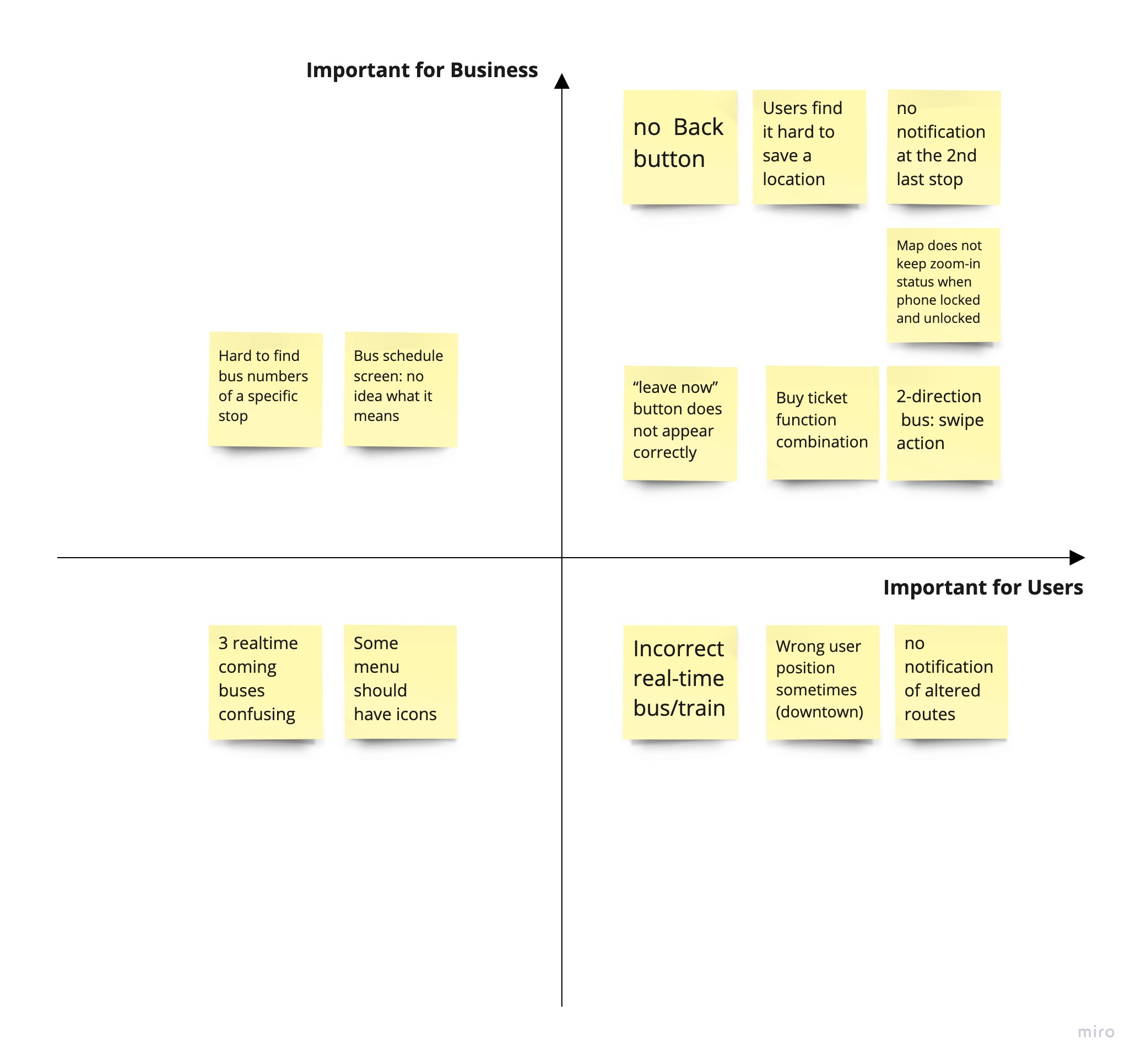
Affinity Map
I synthesized my findings into 3 categories which are Find-vehicles/Start-journey (the main function), App navigation, and Extra functions. The findings then were organized on an affinity map to better understand their relationship to each other and to determine priorities used for the next steps. It is important for me to focus on what would lead to maximum benefit to the app users.
Based on the study, here are the 5 problems I decided to focus on:
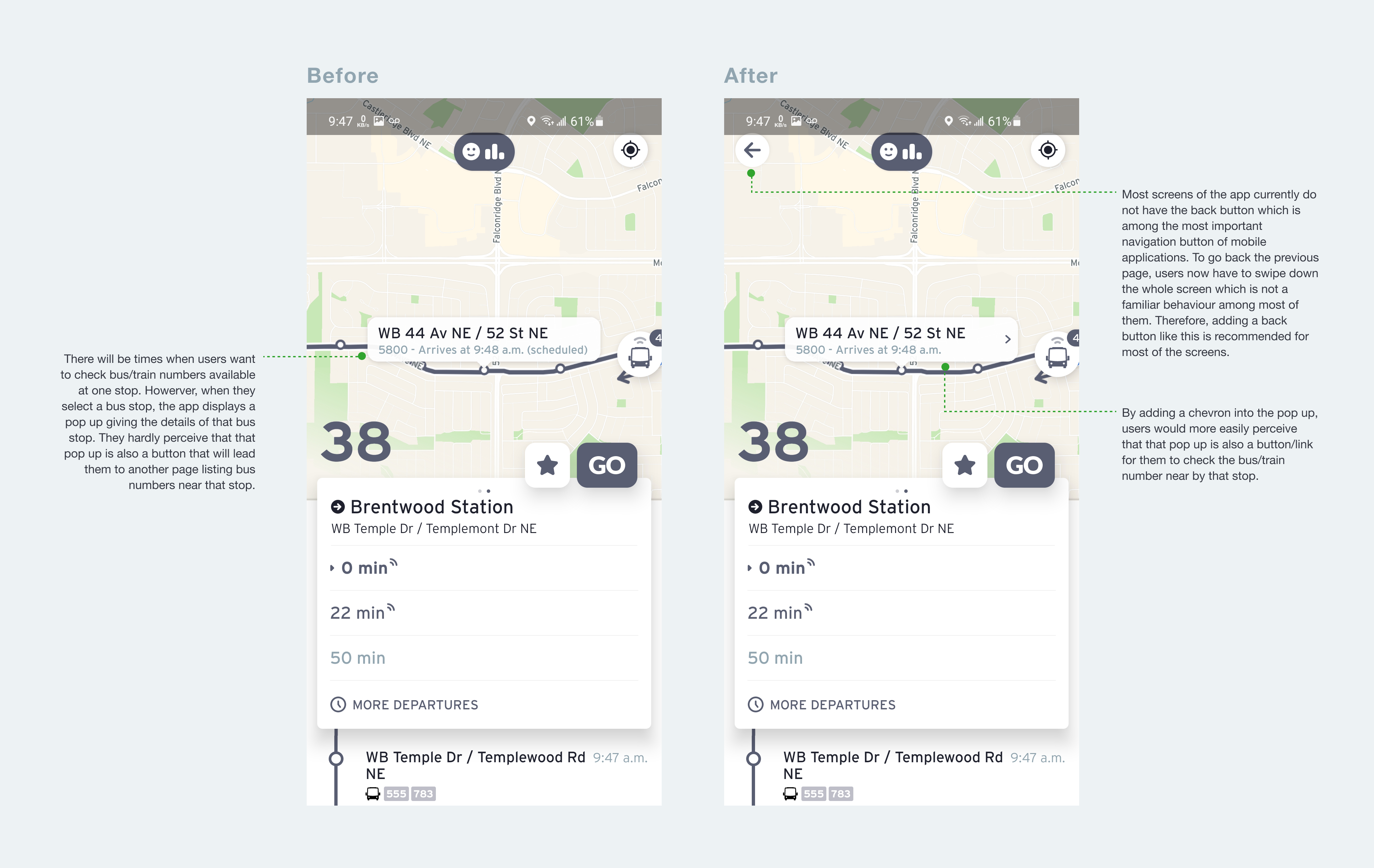
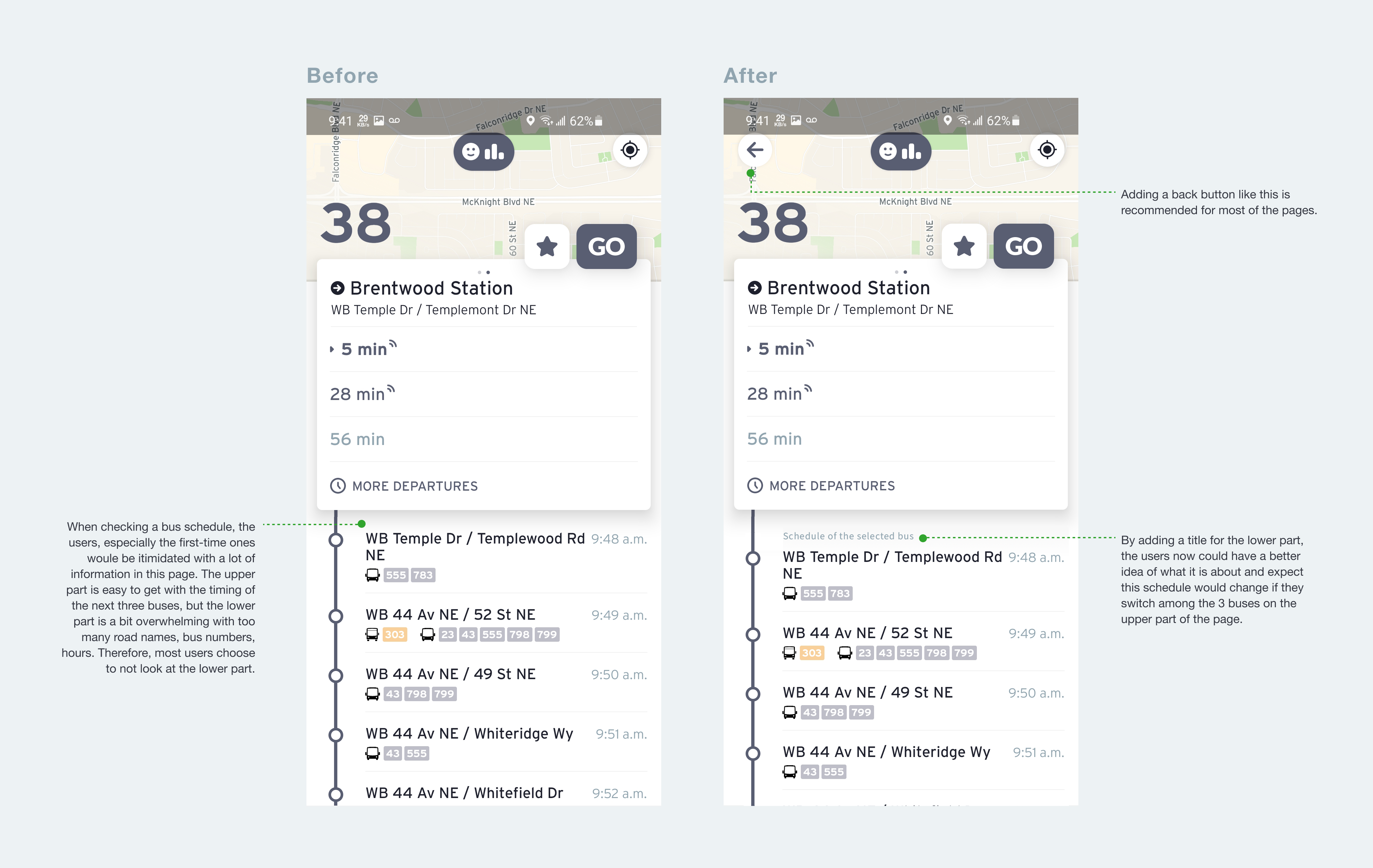
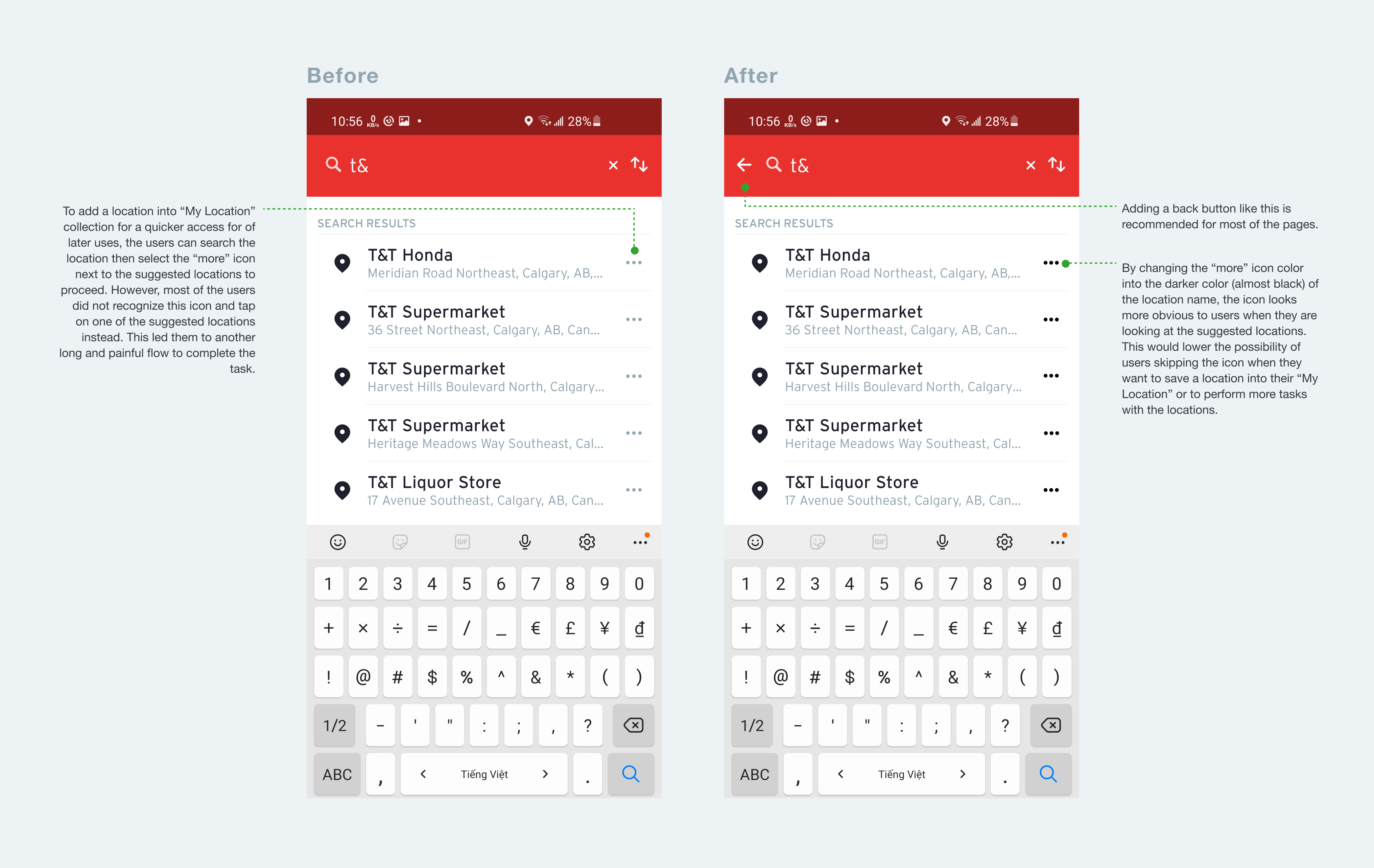
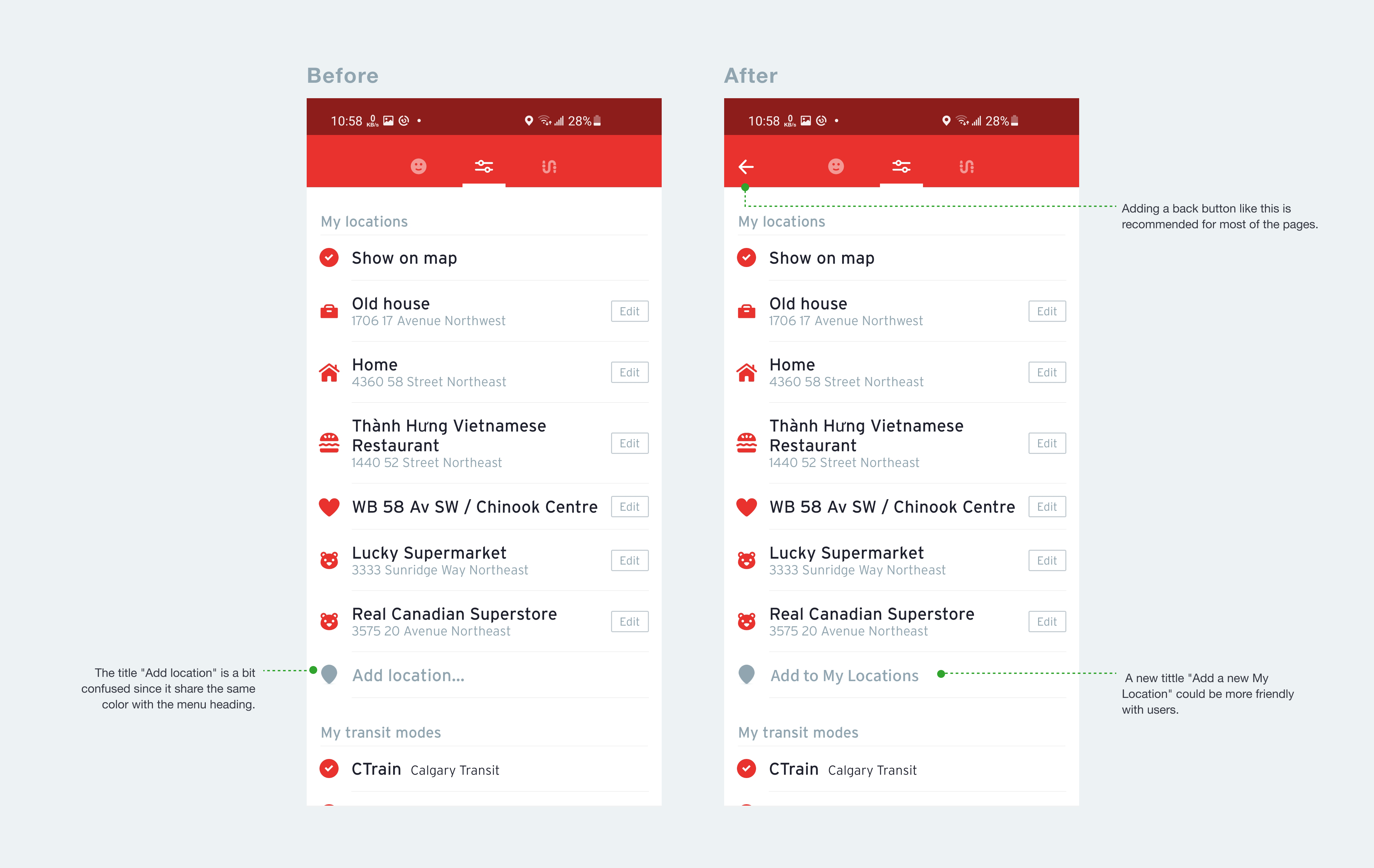
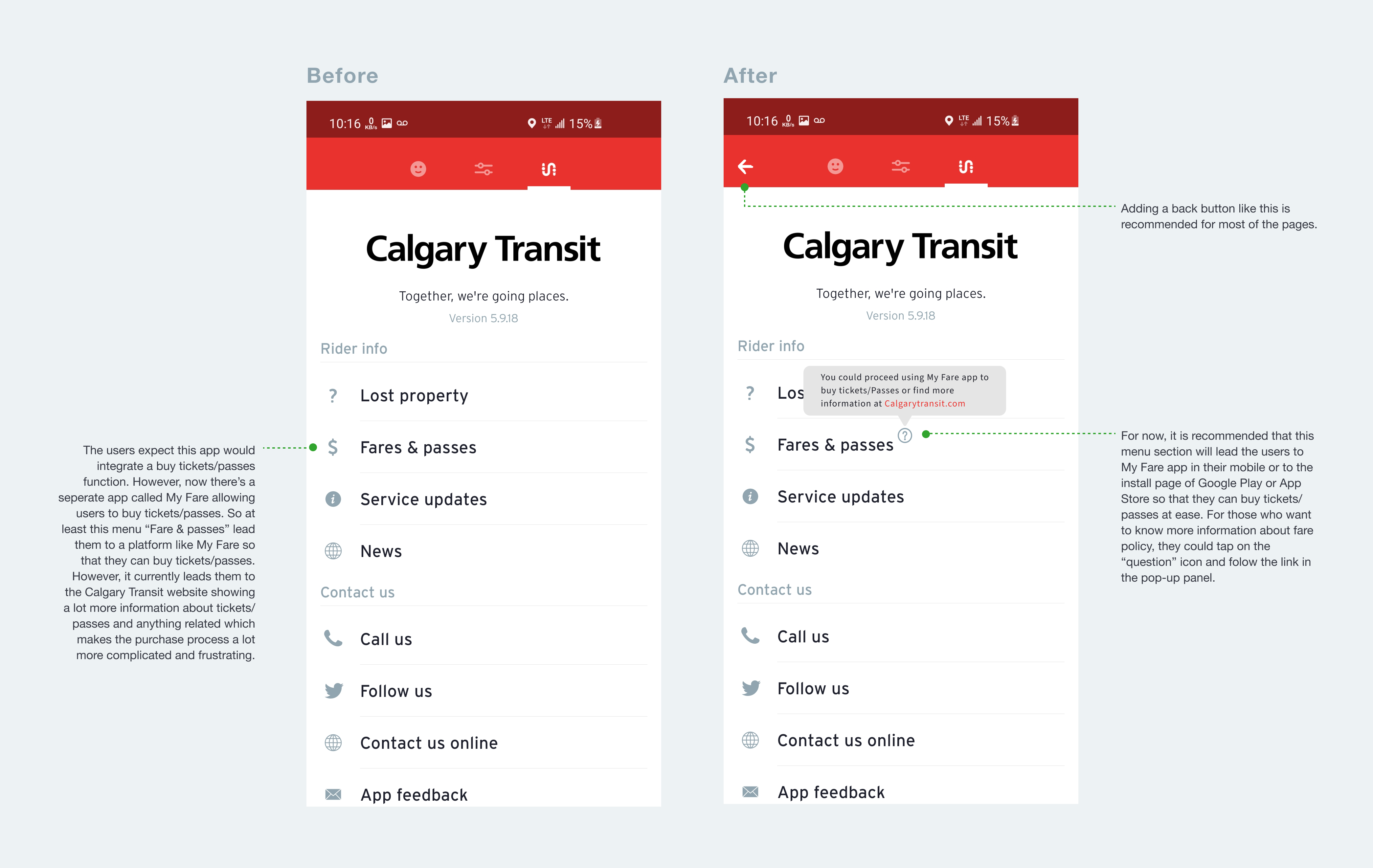
Difficult to navigate in the app without a back button.
Difficult to track real-time position when using the map of the app and to press “stop request” at the right time.
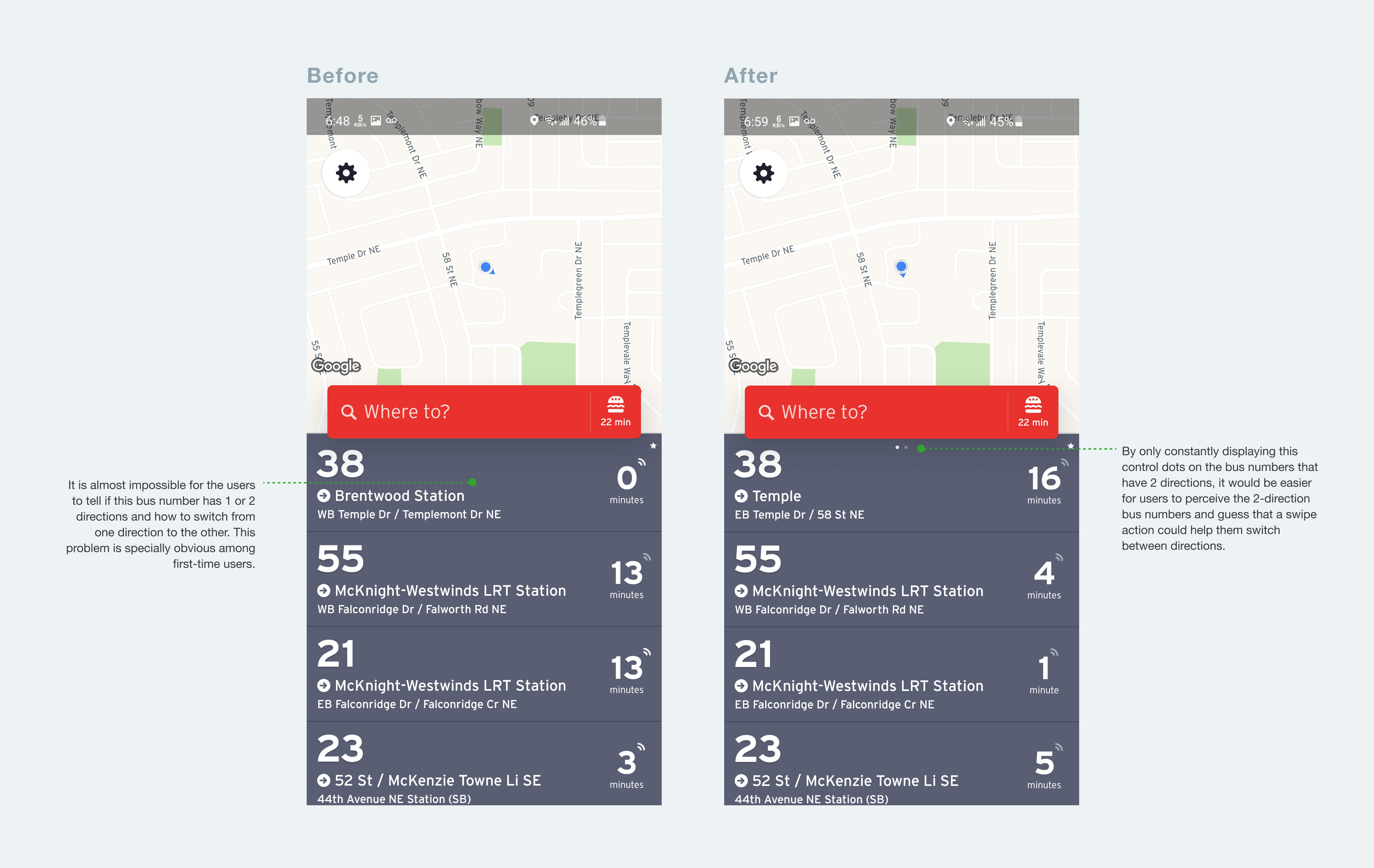
Difficult to find the bus direction they want with the 2-direction buses.
Challenge to find a way to buy a ticket/pass when using this app.
Difficult to save a location for later use.
Persona
To always remember who I design for, I create a persona based on data collected from the user research.
IDEATE
Task Flow
I created tasked flow for steps a user goes through to complete the two main tasks I gave them in Calgary Transit:
A user wants to find bus times or routes to start a journey.
A user wants to save a location in to “My Location” collection for later use.
To better understand where in the process users were having problems, I highlighted the area in purple where most of them struggled, where I can focus on the most during the redesign.
Besides the highlighted pain points, most of the users also suggest adding Buy Ticket/Pass into the app or at least linking the app to another app that offers this function.
Lo-Fi Sketches
Based on the established pain points, I sketched several options to test and see how minimal changes would improve user experience and. During the process of this experiment, I always refer to the target audience (both first-time users and regular users), company mission, and my goal to make enhancements rather than make an overhaul. After a few iterations, I came with the solutions.
1/2
2/2
PROTOTYPE
Hi-Fi Prototype
Moving forward with the solutions, I turned my Lo-Fi sketches into Hi-Fi prototypes. Below is the screen comparison with the before and after side by side.
Animated Prototype
To demonstrate the proposed flows when users looking to save a location for later use, I generated an animated prototype with activities from searching the location, adding location into “My location”. The new design allows users to save a location with various but simple flows.
Clickable Prototype
A clickable prototype was created to validate my redesign. It was important for me to test users on tasks that I focused on to gain more insights and understand what worked well and what needs further improvement. The prototype only covers the aspects of tasks that I want to test users on.
VALIDATE - In progress
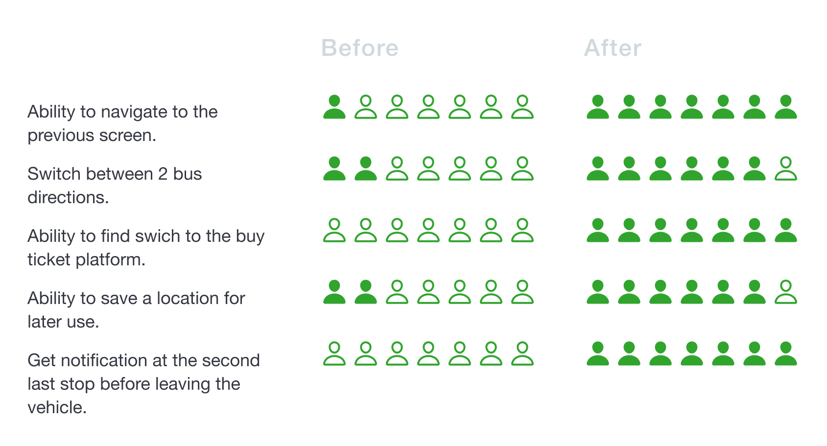
Conclusion
After almost 3 weeks of user research, analysis and redesign, I was able to validate my redesign ideas. I did this by testing my clickable prototype with 7 new users. The results are:
App navigation: 7 out of 7 users feel more comfortable with the back button added.
Find bus directions: 6 out of 7 users were able to find the bus in the opposite direction quickly.
Ticket purchase: 7 out of 7 users were able to buy tickets more quickly and easily.
Save a location: 6 out of 7 users were able to find one of the flows to save a location quickly and at ease.
Bus stop notification: 7 out of 7 users find this function extremely helpful.